

.webp)


Cookie banners need to do two things well: meet legal requirements and give users a clear, easy experience. The best banners are simple, transparent, and make all choices visible. Small design changes, like clearer wording or better button placement, can improve both trust and interaction. Looking at real examples and testing your own setup over time is the fastest way to improve performance.
- Keep language simple and easy to understand
- Make accept, reject, and settings equally visible
- Design the banner to match your site, not feel bolted on
- Check accessibility, including keyboard navigation and screen readers
- Adjust banners based on location and legal requirements
- Track consent rates and test small changes over time
Most websites have a cookie banner, but a lot of them are either annoying, unclear, or designed in a way that pushes visitors towards one option.
If you’re adding one to your own site, it’s not just a compliance checkbox. Laws like GDPR and CCPA set the rules, but how you design the banner affects how people experience your site from the first second.
Our guide looks at real cookie banner examples across different styles. You’ll see what works, how to create a helpful banner, and what’s actually worth copying.
What is a cookie consent banner?
A cookie consent banner is the notice that appears when someone first lands on a website, asking them to accept, reject, or manage cookies.
Cookies are small pieces of data stored in a user’s browser. They’re used for things like remembering preferences, keeping users logged in, or tracking behavior for analytics and advertising.
The banner itself has two jobs:
- Compliance: It needs to have your site meet requirements under laws like GDPR, CCPA, and similar regulations
- User experience: It should give visitors clear control over what data is collected and how it’s used
If the banner is confusing or pushy, people notice. If it’s clear and respectful, it builds trust from the start.
It can also affect performance. The way your banner is designed can influence consent rates, engagement, and even how users interact with your site after that first visit.
Tip: Check out our guide to GDPR and our guide to CCPA to learn the ins and outs of these privacy regulations, as well as how to stay compliant with each to avoid fines and hurt reputation.
What makes a good cookie banner?
A good cookie banner is easy to understand, quick to interact with, and doesn’t get in the way of the user experience.
Focus on:
- Clear, simple language
Avoid ‘legalese’ and large blocks of text. Users should immediately understand what they’re agreeing to without needing to read a full policy. - Easy consent options
Accept, reject, and manage preferences should all be visible and easy to click. Don’t hide important choices behind extra steps. - Aligned with your design
The banner should feel like part of your site, not something tacked on at the last minute. Consistent colors, spacing, and typography make it more trustworthy. - Accessibility support
Make sure the banner works with keyboard navigation and screen readers. Buttons should be clearly labeled and eye-catching. - Transparency about data use
Be upfront about what cookies are used for. If you’re tracking behavior or using marketing cookies, say so clearly.
With those parameters in mind, we scoured the Internet to find a range of real cookie banners to inspire and guide you.
10+ cookie banner examples
Of course, there’s no single “best” cookie banner. What works depends on your audience, your site, and how much control you want to give users.
Instead of copying one approach, it helps to look at a range of examples and find what finds your brand personality the best. Below are different styles, from minimal banners to more detailed setups, along with what they do well and what you can take from them.
United.com
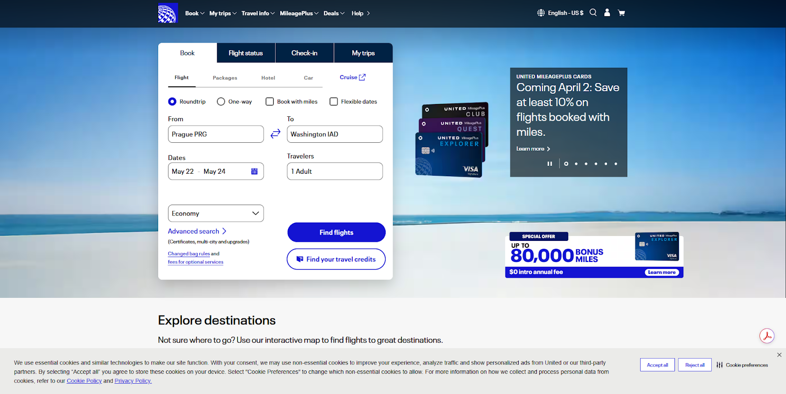
United takes a straightforward approach with a full-width banner at the bottom of the screen. It’s easy to notice, but doesn’t interrupt the booking flow or compete with the main content.
What it does well
- Keeps the message concise and easy to read
- Shows accept, reject, and preferences options upfront
- Stays out of the way of the main content
What to take from this
- Bottom banners work well when you want minimal disruption
- Important actions should be visible without extra clicks
Nike.com

Nike uses a centered modal that takes over the screen and walks users through cookie categories in a structured way. It feels more like a settings panel than a quick notice.
What it does well
- Draws attention immediately without feeling cluttered
- Breaks cookies into categories with short, clear explanations
- Gives clear accept and decline options at the bottom
What to take from this
- Pop-ups work well when you need explicit, informed consent
- Structured layouts make more detailed banners easier to navigate
Subway.com
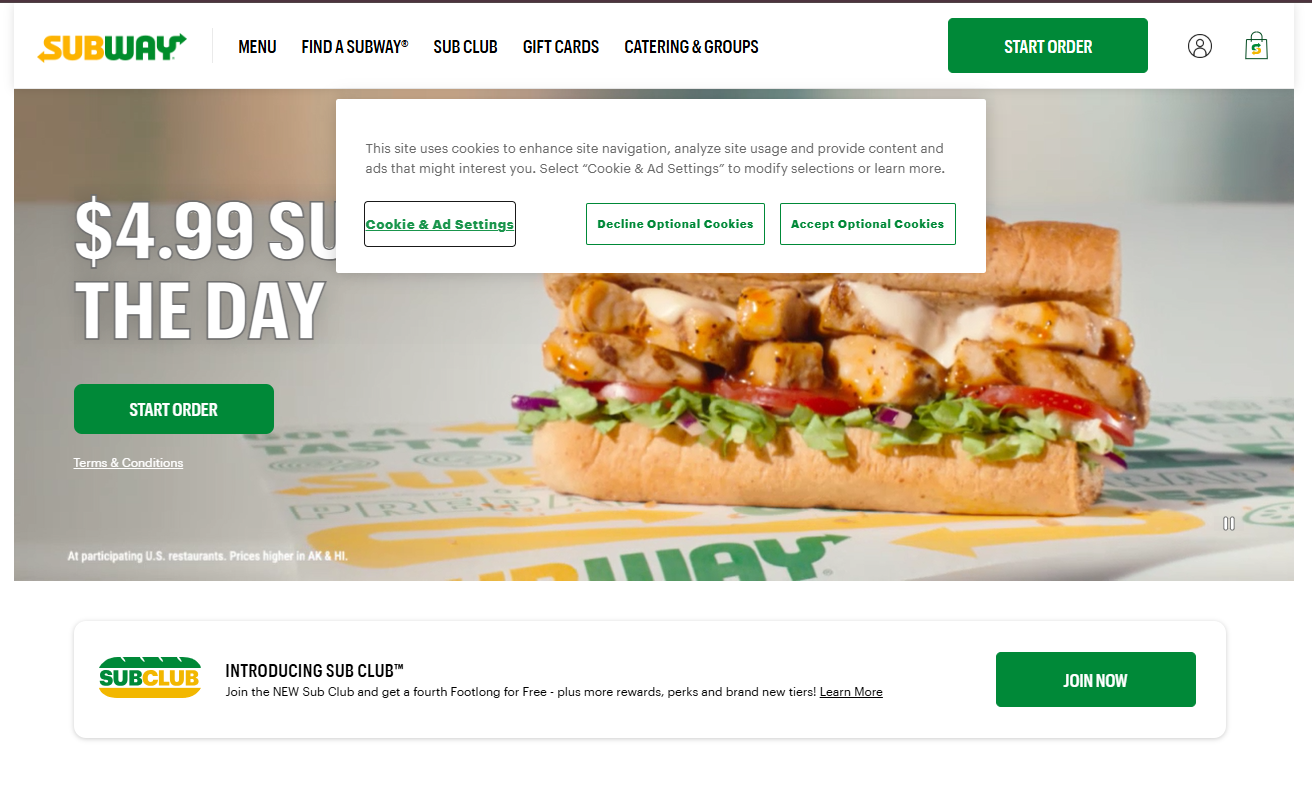
Subway uses a simple, centered banner near the top of the page that blends into the layout while still standing out enough to prompt action.
What it does well
- Keeps the message short and easy to scan
- Uses brand colors to make actions stand out
- Provides clear options for settings, decline, and accept
What to take from this
- Simple layouts can still feel on-brand, especially with the right color choice
- Clear button hierarchy makes decisions easier for users
Oatley.com
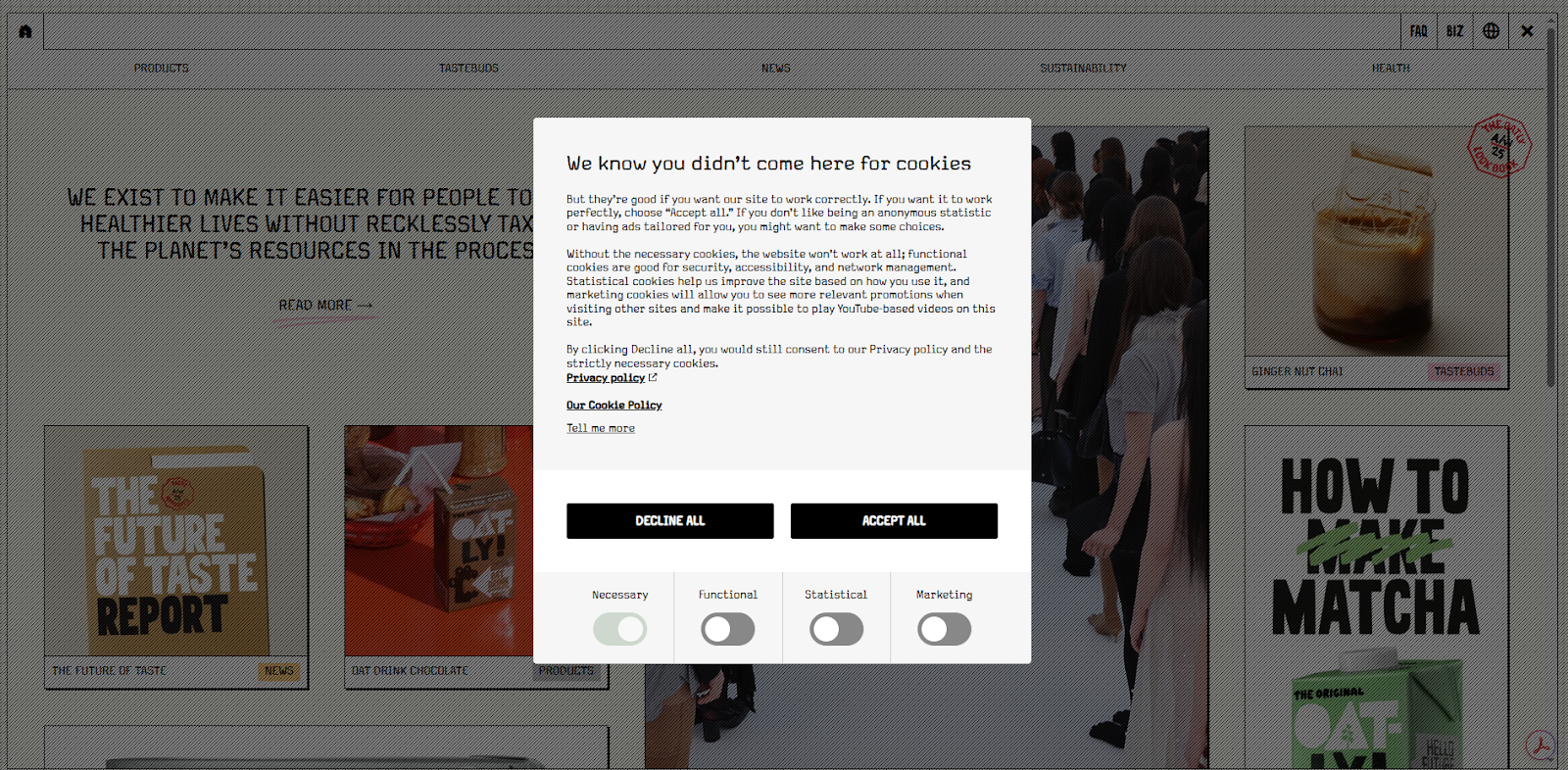
Oatly leans fully into its brand voice here. The banner reads more like part of the website than a compliance requirement, with conversational copy and a tone that feels intentionally informal.
What it does well
- Uses personality without losing clarity
- Breaks down cookie types in a more approachable way
- Keeps key actions visible despite the longer content
What to take from this
- Brand voice can carry through into compliance elements
- Even playful banners still need clear, accessible choices
UptimeRobot.com
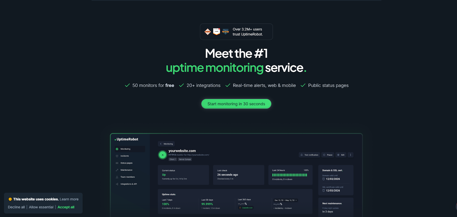
UptimeRobot takes a low-key approach with a small banner tucked into the corner. It’s easy to spot if you’re looking for it, but it doesn’t compete with the rest of the page or interrupt what you’re doing.
What it does well
- Keeps the interaction lightweight and easy to act on
- Uses a compact layout with clear accept and decline options
- Fits naturally into the page without pulling focus
What to take from this
- Corner banners work well when you want minimal disruption
- Not every banner needs to demand attention to be effective
TraderJoes.com
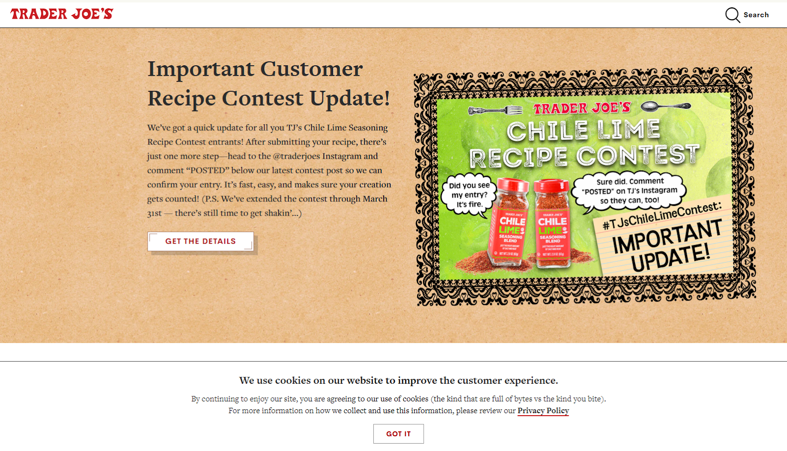
Trader Joe’s keeps things very on-brand, with a banner that feels more like part of its packaging and in-store tone than a standard website notice. The copy is casual, slightly playful, and clearly written for humans, not lawyers.
What it does well
- Uses a friendly, conversational tone that matches the brand
- Keeps the message simple and easy to understand
- Avoids overwhelming users with too many options
What to take from this
- A lighter tone can make cookie banners feel less intrusive
- Simplicity works, especially when the goal is quick acknowledgment
Prague.eu
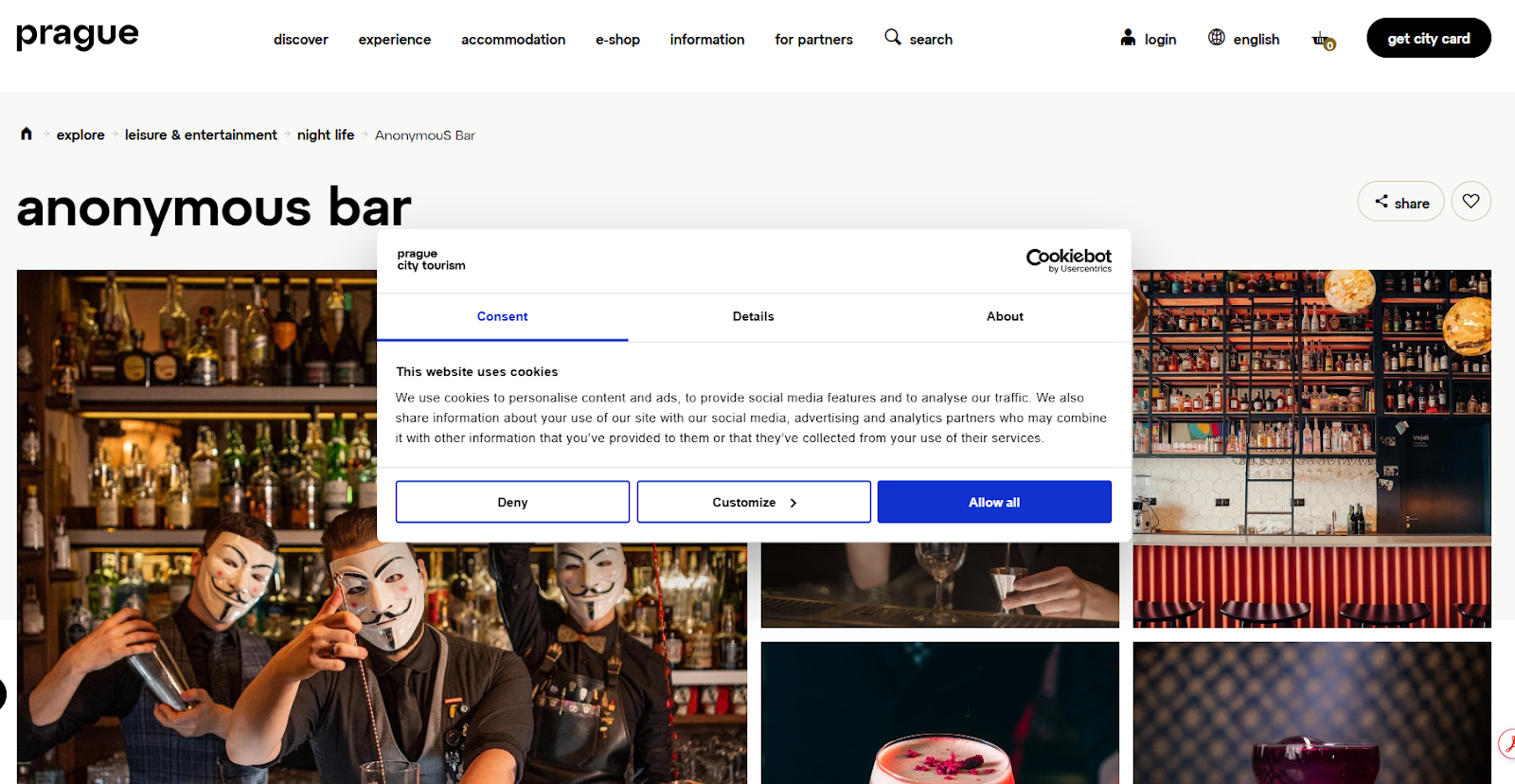
This is a more structured, tabbed modal that puts everything in one place. Users can quickly accept, deny, or switch to a more detailed view to adjust settings.
What it does well
- Presents clear primary actions alongside a customization option
- Organizes information into tabs to avoid overwhelming the user
- Uses familiar patterns that users recognize and trust
What to take from this
- Structured layouts work well when you need to show more detail
- Giving users control without cluttering the first view is key
DisneyWorld.com
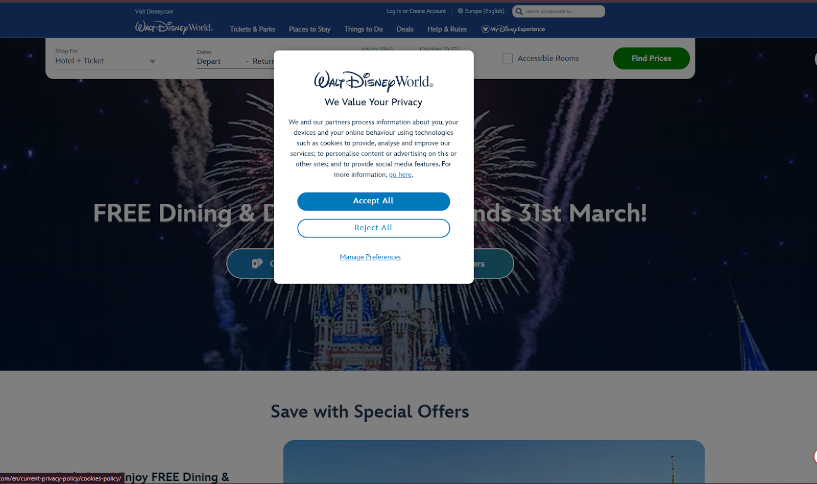
Disney World’s site uses a centered modal that feels polished and on-brand, with a soft visual style and a clear focus on trust and reassurance.
What it does well
- Keeps the layout clean and easy to follow
- Uses clear primary actions with strong visual hierarchy
- Reinforces trust with familiar branding and tone
What to take from this
- A well-designed modal can feel smooth rather than intrusive
- Strong visual hierarchy makes decisions quicker for users
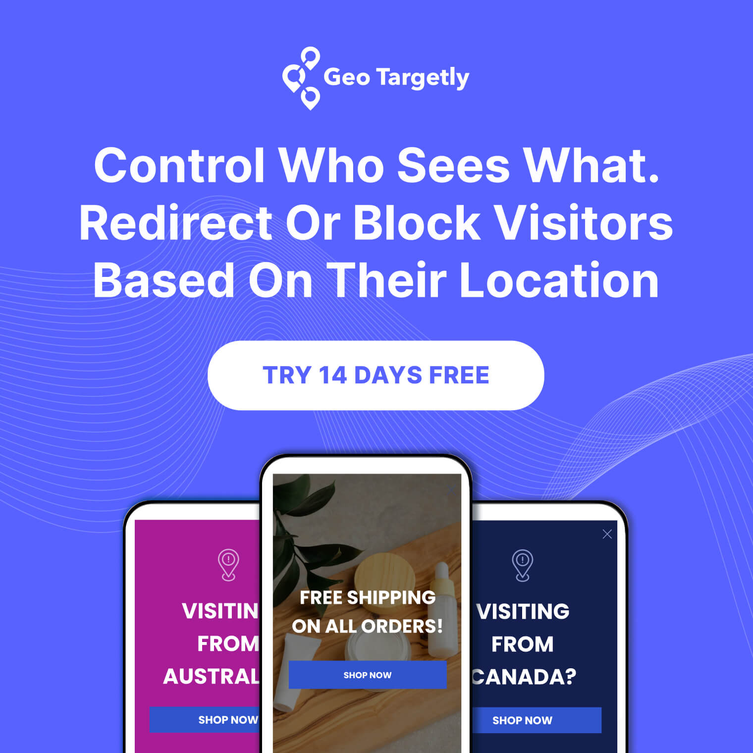
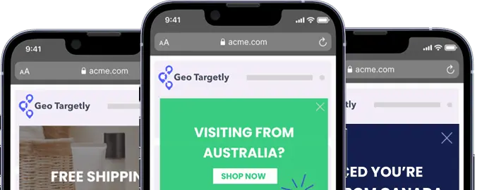
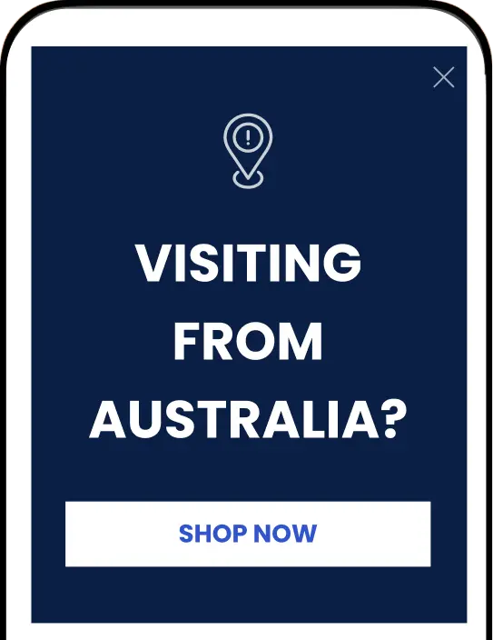
GeoTargetly.com
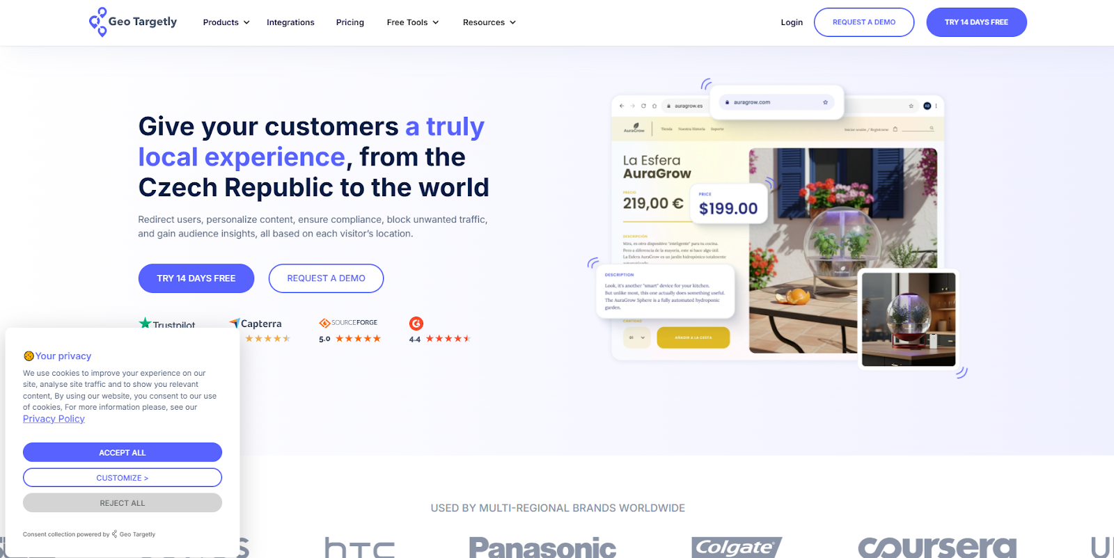
Geo Targetly uses a compact banner in the corner that stays out of the way while still making the key actions easy to find. The layout is simple, but it adapts based on where the visitor is coming from.
What it does well
- Adjusts the consent experience based on location
- Keeps the layout clean and consistent across variations
- Shows clear accept, reject, and customization options
What to take from this
- Not every visitor needs to see the same banner
- Location-based logic can simplify both compliance and user experience
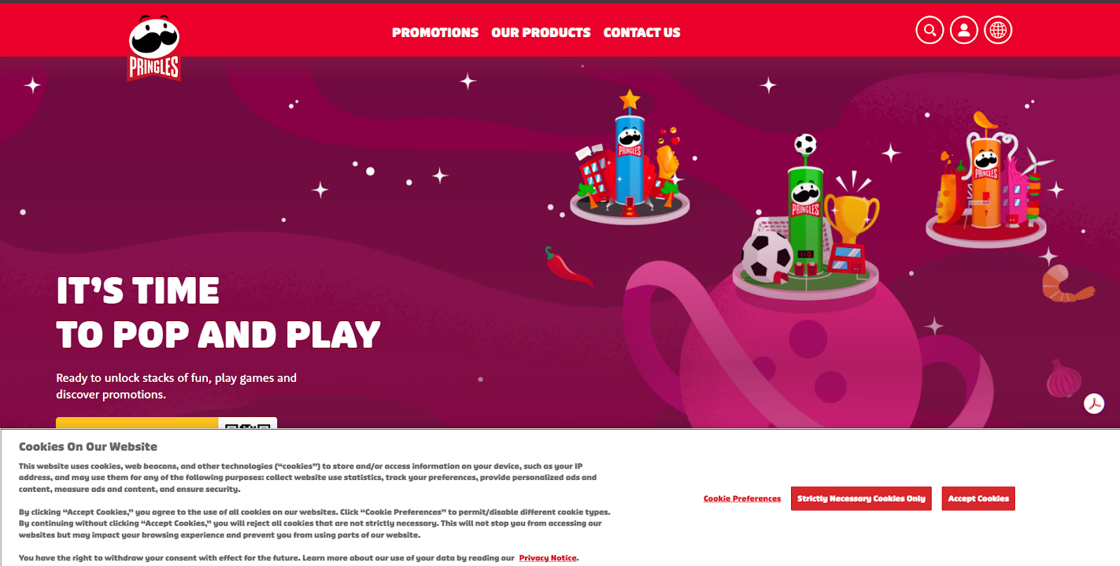
Pringles uses a full-width banner with more detailed copy, but keeps it aligned with its bold, playful visual style so it still feels like part of the site.
What it does well
- Balances detailed information with a clear layout
- Keeps strong brand consistency through colors and styling
- Provides clear options for preferences, essential-only, and accept
What to take from this
- More detailed banners don’t have to feel heavy if the design supports them
- You can include more information without losing clarity
Making cookie banners accessible to all users
Cookie banners need to work for everyone, not just users clicking around on a desktop. If someone can’t easily read or interact with your banner, they may not be able to give or withdraw consent at all.
A few practical things to check:
- Keyboard navigation
Users should be able to move through the banner using Tab, Enter, and Escape without getting stuck. - Screen reader support
Buttons and controls need clear labels so assistive technologies can announce what each option does. - Clear focus states
It should always be obvious which button is selected when navigating without a mouse. - Readable text and contrast
Text should be easy to read, with strong contrast between background and foreground. - Equal access to all options
Accept, reject, and settings should be just as easy to access. Nothing important should be hidden behind extra clicks.
You can test this by navigating your banner using only a keyboard, or by running accessibility checks in tools like Lighthouse or screen reader software.
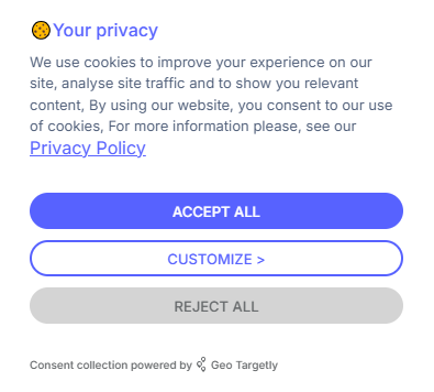
Geo Targetly’s own cookie banner keeps things simple and clear while adapting to different regions.
Use Geo Targetly Geo Consent to control how your banner appears
If you want more control over how your cookie banner shows up, Geo Targetly’s Geo Consent lets you change it based on where someone is visiting from.
Instead of showing the same thing to everyone, you can:
- Show GDPR-style banners only to EU visitors
- Show CCPA options to users in California
- Match the banner language to the visitor’s location
- Skip the banner entirely where it isn’t needed
So people only see what actually applies to them.
If you want to see how that works in practice, you can try Geo Consent with a free trial.
Tracking and optimizing your cookie banner
Once your cookie banner is live, it’s worth checking how people actually interact with it. Small changes can make a noticeable difference in consent rates and overall user experience.
Here are a few things to track:
- Consent rate
The percentage of users who accept cookies. This gives you a baseline for how your banner is performing. - Reject or opt-out rate
How many users decline cookies or adjust their settings. A high number can point to trust or clarity issues. - Engagement with settings
Whether users open the preferences panel and interact with it, or ignore it entirely. - Time to action
How quickly users make a choice after seeing the banner. Long delays can mean confusion or hesitation.
You can test improvements by making small adjustments and comparing results over time. This might include:
- Changing button wording
- Adjusting layout or position
- Simplifying the message
- Testing different levels of detail
Even small tweaks can shift how users respond.
For instance, moving from vague wording to clearer choices or making the reject option more visible can lead to more balanced interactions and better trust.
The goal isn’t just higher acceptance rates, it’s a banner that users understand and feel comfortable interacting with.
Conclusion
Cookie banners are easy to overlook, but they shape how users experience your site from the first moment.
A good banner does more than meet legal requirements. It’s clear, easy to interact with, and gives users real control over their data. That balance between compliance and user experience is what separates banners people ignore from ones they actually trust.
If you’re updating your own banner, focus on the basics first. Keep the language simple, make all options visible, and test how it performs in practice.
Small changes here can have a real impact on how users engage with your site.
FAQ
What should my cookie banner say?
Your cookie banner should clearly explain what cookies you use and give users a real choice.
At a minimum, include:
- what cookies are used for
- an option to accept
- an option to reject or manage preferences
Keep the language simple. If users have to think too hard about what they’re agreeing to, the banner isn’t doing its job.
What are the different types of cookie banners?
There are a few common approaches, depending on how much control you give users.
You’ll typically see:
- Simple notice banners (inform users but don’t require action)
- Opt-in banners (users must accept before cookies are set)
- Opt-out banners (cookies are enabled by default, but users can change settings)
- Preference-based banners (users choose which categories to allow)
Which one you use depends on your legal requirements and how much flexibility you want to offer.
What are the requirements for a cookie banner?
Requirements vary depending on where your users are located, but most regulations follow similar principles.
In general, your banner should:
- Clearly explain what data is being collected
- Allow users to accept or reject cookies
- Avoid pre-ticked boxes or misleading wording
- Make it easy to change consent later
Regulations like GDPR and CCPA have specific rules, so it’s important to match your setup to the regions you serve.
What is an example of a cookie in advertising?
An advertising cookie might track which pages a user visits and what products they view.
This data can then be used to show more relevant ads, such as retargeting someone with a product they looked at but didn’t buy. For example, if a user visits an online store and views a specific item, an advertising cookie can be used to show that same item in ads on other websites.

Copywriter